
Cloud Strife is one of the single biggest video game characters of the 90’s! I’d never had to draw him and I thought to myself “That’s Crazy! Dood” so last month I decided there was no time like the present to learn how to draw Cloud Strife. He seemed liked the perfect character to draw and I could present him as my artwork for the awesomely epic Drawsome! December theme of Video Game Characters.
I really wanted to push myself with this artwork and to try some things that I hadn’t done much of in the past. The awesome thing about Cloud Strife is that his outfit is made of so many different materials such as cloth, metals and leather. In particular with the metals and leather clothing I questioned my artistic ability and whether I would be able successfully draw that level of detail. Instead I decided to use Textures to create stylistic effects instead. Let’s take a look and see how I did.
Sketch Phase
Sometimes I’m absolutely amazed that my rough sketches turn into anything like the final artwork. It’s laughable, as I look at my initial rough sketch, that It could ever turn into anything other than scribbles! I’ve always said though that the scariest thing for me is a blank canvas and the best way to rid myself of that is to throw down something as quickly as possible.
When I was learning how to draw Cloud Strife I wanted to ensure that I could give him a bold and strong pose, something that reflected the strong character that he is. I worked this artwork in three stages.
Firstly I created a very rough sketch and followed that up with some refinement over the top. Each time I refine I lower the opacity for the entire layer and then I create a new layer and refine over the top of my lines. I repeated this step once more for a third stage of refinement and the result is my final sketch.


Line Art Phase
Lately when I’ve been creating my line art I tend to go with something like the 12px brush. I like a finer tip so that I can make my lines a little more precise and to me it feels like I’m using pencil a little bit more. However for some reason I didn’t change my brush size so I just created this with the default 19px brush in Photoshop. In the end it wasn’t a huge problem and still turned out nicely. Every artist is different so just have a play around and see which works best for you. If you’re following along with this how to draw Cloud Strife tutorial then you should also try to vary your line weight to make your lines look more dynamic!
The following images will give you an idea of what my final line art looks like and also what it looks like over the original sketch. It’s important that your refinement process, in the sketch phase, is clear and clean enough for you to add your line art over the top. If you rush your sketch it can become painful when you’re adding your line art, trust me I always find this out the hard way!


Personally I love it when the time comes to hide your sketch layer and you get to see your line art for the first time. Clear, crisp and beautiful….at least that’s what you hope it is. When I was figuring out how to draw Cloud Strife I was really worried that my line art was going to turn out badly but what I have noticed is that sometimes you need to trust yourself that it will turn out well in the end.
At times you might need to see the complete line art before you can give an honest opinion on how well you did. In this case I thought the line art might turn out poorly and instead I was really happy with the final piece. Remember that some things won’t be as noticeable once you add color or even color your lines.
Let’s Add Color
Onwards to the coloring and it’s time to first add our flat colors. In Photoshop I do this by creating a new layer for each flat color however I’ve seen many artists add all their flats on a single layer. It really is up to you and I’m sure there are advantages to both methods.
If you want to add color quickly you can use the Magic Wand Tool on your ink layer, and holding the shift button, you can select multiple areas that will be a particular color. For example use the Magic Wand Tool to select all of the skin color, create a new layer called skin, select -> modify -> expand by 3-6px and then fill your selection with your color. Rinse and repeat this for all the other flat colors.
Once your flat colors are added it’s then time to add your shadows and highlights. Again, I personally like to do my shadows and my highlights on separate layers but it’s totally up to you. The general idea is to select a color that is lighter, than your flat color, for highlights and a color that is darker for your shadows. In some areas such as the legs I’ve added a secondary shadow to create a greater sense of depth to the clothing that Cloud is wearing.
One of the challenges I had, when figuring out how to draw Cloud Strife, was his baggy trousers and that there were far more folds, which created shadows and highlights, in his trousers than other characters I’d draw before. Although I’m happy with the final product I feel that I could definitely improve in this area by having a greater understanding of how clothing falls around the legs and the types of shadows that might create.


It’s time to add Textures!
This is where things got interesting and I decided to push myself out of my comfort zone. This is the great thing about Drawsome! because each month I want to do something bigger and better than the month before, I’m competing against myself! There were certain features about Cloud such as the shoes (leather), shoulder armor (metal) and the sword (metal plus scratches) that I wanted to portray in my artwork. The problem was that I didn’t feel I had the technical ability to create this level of detail with Photoshop brushes as some artists might.
Instead I decided to use Photoshop textures or simply Textures. So what is a texture? Well a texture could be anything you want really but basically it’s an image that you can load into Photoshop, or any graphics program, which allows you to fuse the texture with your artwork, so to speak. Let me try to explain more simply. Say for example you created a tree and you wanted that three to look like it had wood grain, well you could simple search for a wood grain texture. in Google, and combine that with the wood color of your tree.
So I wanted three textures for my artwork, leather, metal, cloth and a scratchy sword texture. In the end I managed to use three different textures, just by searching in Google, and finding something that might work. You can do the same just by searching for “Photoshop Textures” or the exact kind of Texture you might be looking for.


Let’s see how they look when they’re applied to Cloud Strife by just showing you the areas where I used them. I’ll also zoom in a bit closer for you so that you can see the detail that they add. The pictures might be a little bit grainy but hopefully you can see the affect it has. As my artwork is a full body image of Cloud some of the detail such as the leather on the shoes and his chest are lost because we are zoomed out.
In future I might only use textures depending on whether I felt that it would make a visible impact to the final artwork.


Final Presentation
The last stage I like to do is add some final touches to the artwork which will hopefully compliment the art and add some extra POP. Again a method of doing this is to add a texture to the background and many artists will do this to add different effects. I wanted to keep with the scratchy worn kind of feel that I’d gone with for some of Cloud’s gear. So let’s take a look at what I did.
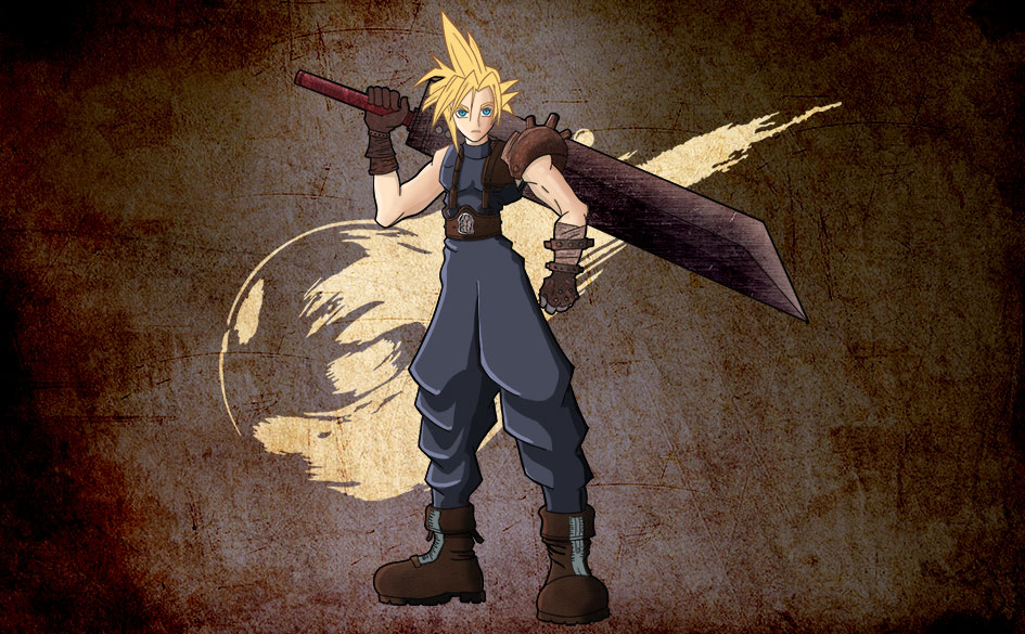
Below you’ll see the final image and to the right hand side you’ll see three small images. The image at the top shows the texture that I used to create some of that roughness I was after for the background. Secondly you see Cloud Strife on top of that texture. The third picture is a blue background I created myself using a radial gradient and then adding some additional lightness around the outlines of Cloud.
Finally to combine it all together I placed my texture on top of the blue layer and switched the textured layer into Linear Burn mode which is just one of the many filters you can use to overlay it with other layers below it..


Game Over Dude!
So there you have it, what did you think? Were you a big fan of Final Fantasy VII and have you ever attempted to learn how to draw Cloud Strife? This artwork was really fun and overall I think it might be my best yet. The great thing is that each month the artwork that I complete for Drawsome! ends up being my best yet so I can’t see what I come up with next month.
Are you familiar with using textures in your artwork and do you know any better methods for achieving similar affects? As always you might have better ways of achieving the same results so feel free to shout them out in the comments below and that will give me something to try for the next artwork I create.
In the mean time most of you should be aware now that the Drawsome! theme for this month is Anime/Manga characters. Make sure that if you want to get involved, and have a chance of the prizes, that you sign up to the community forums and get active. The community is already building up a really awesome group of people and I’d love more people to get involved. So always always, make sure you don’t miss out on the fun!
It is really cool to see your process here, I had never really thought about using textures like that! Makes me kind of curious as to whether I can do that in Sketchbook Pro…
Good idea with the textures! I always wondered how digital artists managed to make clothing look like clothing, guess that answers my question!
How do you get your lines so smooth? 😮
Hey rachel! there are all kinds of methods artists use for getting the textures right, I think most of them paint it themselves which blows my mind. In terms of the lines, you should have a fairly high resolution say 3000 x 3000 at least 300dpi. Then instead of tracing the line just take a few turns at doing it in one fluid motion, if you stuff up just undo and try again. If you watch some of my other videos you’ll see I hit the undo button all the time!