
What’s up my cartoon fanatics and manga maniacs? It’s Byron here and today I wanted to focus today on digital drawing. Listen up guys, digital drawing is so much fun guys! You probably already know that though, right? This week I surprised myself when I managed to create my first digital drawing that I was proud to show off to you guys. Seriously, if you’re not drawing digitally yet, or you’re afraid to get started, then just give it a go and you might just surprise yourself like I did.
Paris Christou, from ToonBox Studio, that we’ve highlighted in prior posts is incredibly passionate about digital drawing and emphasizes that when you’re beginner it has so many advantages. For example you can fix your mistakes easily, it’s not as messy as traditional painting but most importantly allows you to have so much FUN. You don’t have to worry about pencils or pencil sharpeners of giving your parents a heart attack when you spill your paint over the carpet (word of advice I don’t recommend doing that).
You guys know me by now, I’m not the best artist in the world, I’m only a passionate beginner trying something I should have started doing years ago. I’m learning every day and all of this is new to me. As I learn and teach myself something new I understand that there is somebody out there, in the universe, who is struggling with the same things I’m struggling with. If that’s you then I hope this helps you in some way.
What You Need
- Digital Tablet – such as Wacom Bamboo or Intuos (Cintiq if you’re really lucky)
- Scanner – If you started with a pencil sketch like I did
- Photoshop – You achieve the same output with a cheaper solution like SketchBook Pro however this tutorial will be based on Photoshop
Getting Started With Digital Drawing
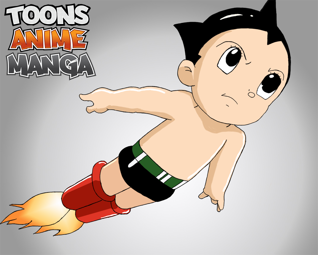
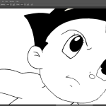
At this point in time I’m not strong when it comes to remembering the character from my head and putting that onto paper. So in this instance I found a reference Image of Astro Boy which I could use to create recreate the pose. I didn’t trace the image but merely used it as a guide for me to reference and sketch out on the paper.
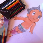
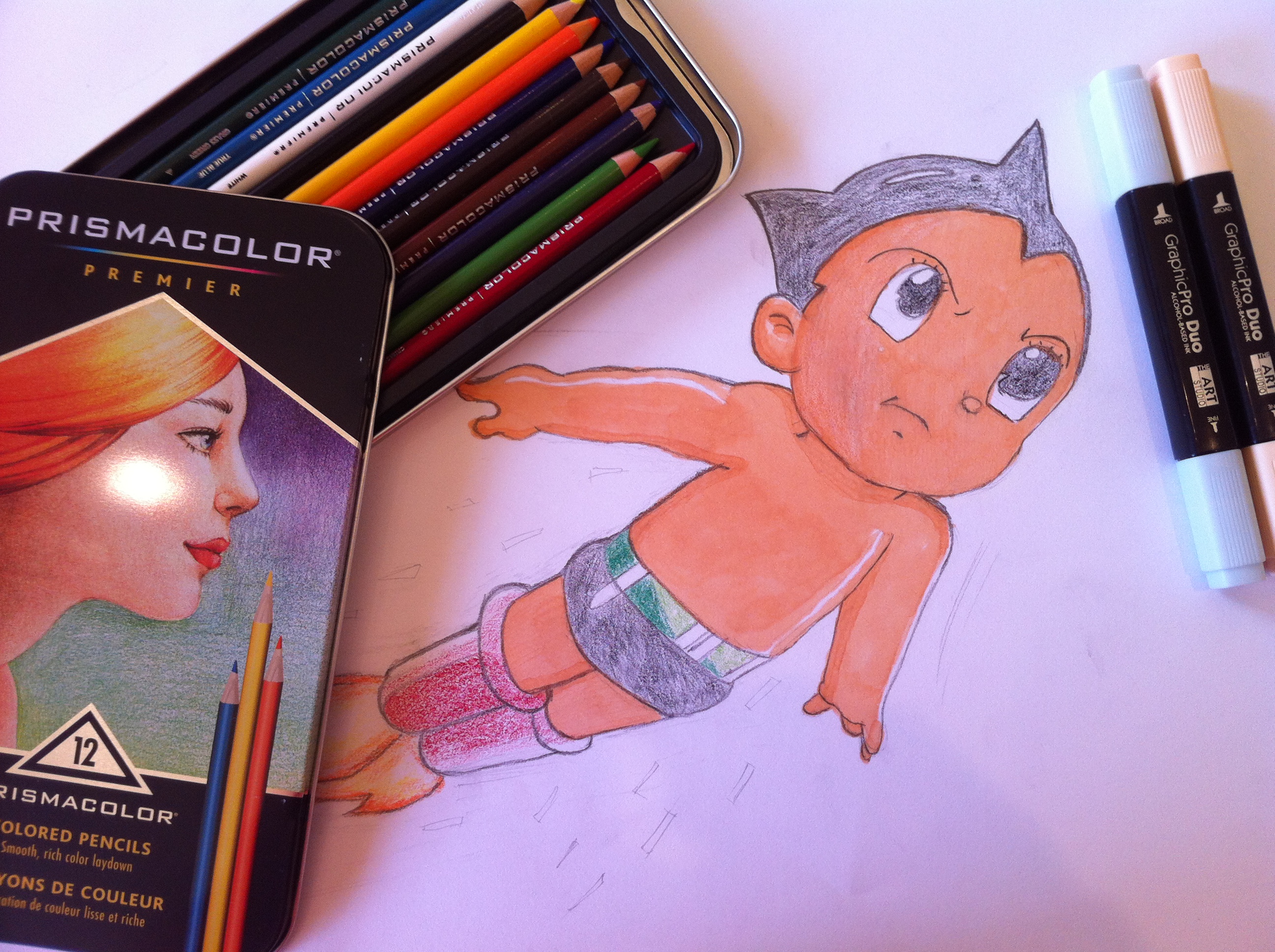
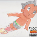
In terms of sketching Astro Boy he’s pretty simple with the hardest part being his hands but more so his left hand (right side of picture) in this instance. Overall the sketch for Astro Boy was pretty easy to get it down on paper. I used a 2H pencil for the initial sketch and then later went over the lines with a HB. Also this week I decided to purchase my first pack of Prismacolor Pencils and two Copic markers (no name brand actually). I’m fairly limited on colors and my color theory needs work when it comes to blending but you’ve got to start somewhere right?
In this instance I decided to practice my coloring skills with my new items. I used the Copic markers to color the face and skin and then Prismacolor pencils to color the remaining aspects. Overall I really wasn’t that happy with my coloring effort as it came out really grainy, maybe because of the paper, and the colors just didn’t match my reference image.
Firstly the left eye (right hand of image) has some issues that I didn’t see until I’d completed the digital drawing. The advice I’ve been given is that you should turn the drawing upside down as it will help the brain to spot these kind of errors. Secondly I also messed up the right hand side of the face (left side of image) by making it too dark with the copic marker. I tried to fix this by using a White Prismacolor pencil but the damage was already done.
In the future I’d like to get some more Copic markers so I have some additional colors to work with that will hopefully suit my reference image better.
-
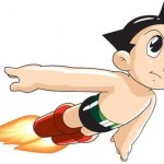
- Astro Boy Reference Image
-
- Prismacolor Pencils & Copic Markers
-
- Astro Boy Pencil Sketch
Inking
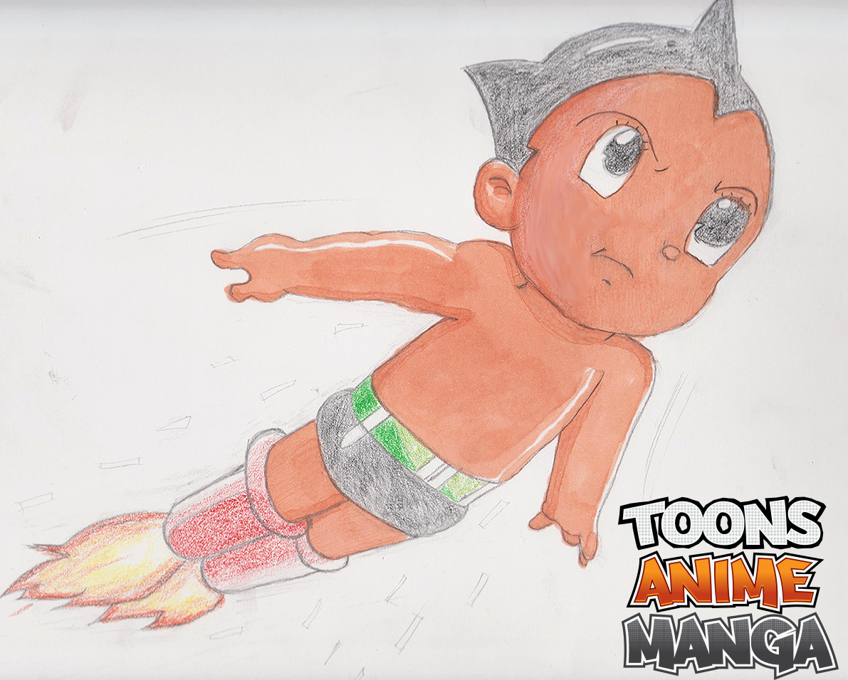
So, I never really planned to draw this image digitally but when I stuffed up the coloring in the sketching phase above I decided to scan the image at least to show the fans, on the ToonsAnimeManga Facebook page, and use it as a lessons learned. I feel its really important on this page to talk about my failures as well as discussing the success. We can all learn from failing and we have to embrace it and not fear it.
Firstly, I scanned in the page at 300 dpi on a home Canon scanner. The scanner didn’t do a very good job when it came to accurately representing the color that was on paper. I opened the image into Photoshop and decide I’d attempt to draw this image digitally. When it comes to digital drawing the first step is to ink the outline of your artwork.
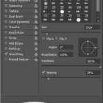
As beginners it can be really easy to get caught up with your brush settings. I find myself watching more experienced illustrators and spending more time asking them about what brush settings they’re using as if it’s magical brush that makes their drawing look awesome than mine. If only I could use the same magic brush for my drawings and I could be awesome too. The fact is that their brush settings are only one aspect and the other part is their skill from practicing illustration but also practicing with their digital pen.
Regardless of that, I simply used the default Pen settings shown below. When it comes to inking you want to make sure that you remove Color Dynamics because that means you’ll have color variance in your lines based on the amount of pressure you put into your Pen. Color Dynamics should be switched on if you’re sketching however as it can look more like a traditional pencil sketch. You want your lines to be clean and solid so switch this option off for now guys and gals.
-
- Photoshop Brush Settings
After you’ve got your settings right It’s as simple as tracing around your lines. I’m right handed so I find that it’s easier to have your graphics tablet on the right hand side and your workstation keyboard on the left hand side (opposite if you’re left handed). I recommend this because you can continue to undo your line mistakes and redo them again really quickly using the Control Z undo shortcut.
We’re using a fairly high dpi of 300 but you could also use a higher dpi of 600 for even sharper lines. You don’t want to fuss too much over your lines at this point because realistically most people aren’t going to notice the flaws in it except you. When you reduce the image to lower resolutions to upload to the web, for example, many of those mistakes in your line work will be much less noticeable. Let’s take a look at my line work close up and then look at the final inking.
-
- Digital Drawing – Ink Lines
-
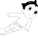
- Digital Drawing – Final Ink
You can see from the above that there are plenty of mistakes in my line work but when we reduce the image in size to the final image, ready for upload to the web, many of those mistakes won’t be so evident.
Finally when it comes to your lines, to make it easy for yourself in the coloring phase, you want to make sure that you’ve closed any gaps between your lines. If you don’t close the gaps it will be more difficult to select certain areas for coloring in the final phase.
Coloring
Coloring can be tough. We’re fortunate that with our reference image most of the colors are flat with a few highlights. This makes it easier for us. If we needed to start using gradients then it would be a little bit tougher for us as beginners. So to start this off we want to start laying down our flat colors.
Basically we’re going to be repeating the same process over and over for the different areas we need to color. So let’s take a look
Coloring Workflow
1. Embed the reference image into your digital drawing
2. Select the magic wand tool ![]()
3. Now that you have the wand tool selected our aim is select all of the areas that are the same color. So for example let’s work on the skin first.
4. Click on the face with the magic wand, if you’ve closed your lines correctly you’ll only select the face
5. Hold down the shift key and click the wand tool over the chest as it will be the same color as the face
6. Hold down the shift key again and click the wand tool over the upper legs. You should have all three selected now.
7. Create a new layer in Photoshop and ensure the new layer is selected
8. From the menu go to Select -> Modify -> Expand and expand the select by 3 pixels. By doing so we ensure that our color fill goes just past the edge of our ink lines. If we didn’t do this step we might see white space between our lines and the fill color.
9. Select the color dropper tool ![]() and grab the skin color from the reference image
and grab the skin color from the reference image
10. Once you’re ready grab the paint bucket tool ![]() and fill the selected space with the referenced color.
and fill the selected space with the referenced color.
11. Repeat this process for all the other colors you can see. In my case I did separate layers for the boots, belt, eyes and flames
12. Once you’ve put the base colors down you can go through and add the highlights and shadows. Again use the reference image with the dropper to get the colors you want.
13. Select the pen tool again  and color in the highlights and shadows
That’s pretty much it guys it’s really simple so just keep practicing the process and if you have any questions then let me know OK, I’m here to help and I want to learn with each other.
Gradient Tool
Finally I wanted to discuss using the Gradient Tool. The Gradient tool can help you to polish off your final image a little better, it just tends to make it pop out of the screen a bit more. Also I’ve used the gradient tool for the flames to get a better flame affect then if I was to draw it manually with the pen tool and layer different colors.
Drawing the Flame
1. Follow the process listed above to just select the flame section with the magic wand
2. Create a new layer (If you haven’t already from above)
3. From the menu go to Select -> Modify -> Expand by 3 pixels
4. Select the gradient tool ![]()
5. Set a gradient with three colors going from white to yellow to orange.
6. Set the gradient to a Radial Gradient ![]()
7. Click the cursor down at the base of the flame, hold it down, and drag it to the tip of the flame.
8. Now you have your flame affect. You might have to take a few attempts at it to get the flame looking the way you want. Change the gradient if you need or try applying that gradient in different directions.
Background
When it comes to the background simply create a new layer which is behind all of the layers you’ve already created. Select the gradient too again. I’ve used a white to light grey gradient and applied it to our new layer. Again I’ve used a Radial Gradient and by doing this allows me to attract the eyes to Astro Boy and it helps to pop the colors out of the screen by darkening the outer edges of the background.
Finishing Up
So there you have it guys, it’s that easy! I really want you guys to have a go at doing this and share your images below. I’m really friendly and so is everybody else that visits this blog so lets use it as a place for encourage and critique, because we’re going to improve so much faster. Place your links or images in the comments below so that I can see how you finished up.
If you want to ask any questions then you can do it on the comments below, the Facebook page or on Twitter. Click any of the links to take you to the appropriate place. Please add us and keep in touch with any future tutorials we put up.
Guys and Gals we’ve got so much great stuff planned and coming your way soon so keep checking in guys and I promise you won’t be disappointed.
nice
Thanks for stopping by and checking out the post
[…] Beginners Guide To Digital Drawing with Astro Boy […]